A mid-core mobile game, with the style and game mechanics of an old-school RPG. The game has been up and running for over 6 years, with great KPIs and a big dedicated fan base.
I was the authority on anything UX related: research, planning, wireframes & specs, tutorials and user tests.
Graphic Team Lead
Led the UI graphic design team, and directed the marketing graphic design.
Product Manager
KPIs & feature goals, kickoffs & standups, Jira & Trello, planning and executing feature production, and monitoring the analytics.
Focus on
Designing a new HUD
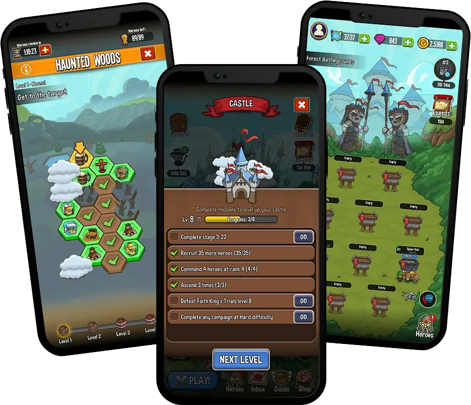
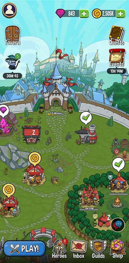
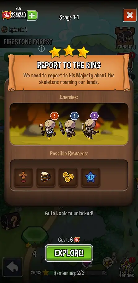
The game was running out of space to expand, so we’ve remade its core UX, and had to design a brand new HUD*.
The game got bigger, and needed a more robust economy, with more resources/currencies to gather and new features and gaming modes to gather them from. The game’s UX architecture, screen navigation and HUD was becoming a mess.
To solve this, we’ve added a new home screen (the player’s kingdom) and a new HUD layout to incorporate all the new features and game modes. This massive change affected every part of the game, from the FTUE to the Shop’s galleries, but here I’ll focus on the new HUD, and how it came to be.
*
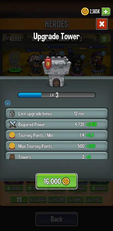
The HUD (Heads-Up Display) is a crucial UX component in any game, containing the UI elements that should stay visible and/or accessible at all times
The game was running out of space to expand, so we’ve remade its core UX, and had to design a brand new HUD*.
The game got bigger, and needed a more robust economy, with more resources/currencies to gather and new features and gaming modes to gather them from. The game’s UX architecture, screen navigation and HUD was becoming a mess.
To solve this, we’ve added a new home screen (the player’s kingdom) and a new HUD layout to incorporate all the new features and game modes. This massive change affected every part of the game, from the FTUE to the Shop’s galleries, but here I’ll focus on the new HUD, and how it came to be.
*
The HUD (Heads-Up Display) is a crucial UX component in any game, containing the UI elements that should stay visible and/or accessible at all times
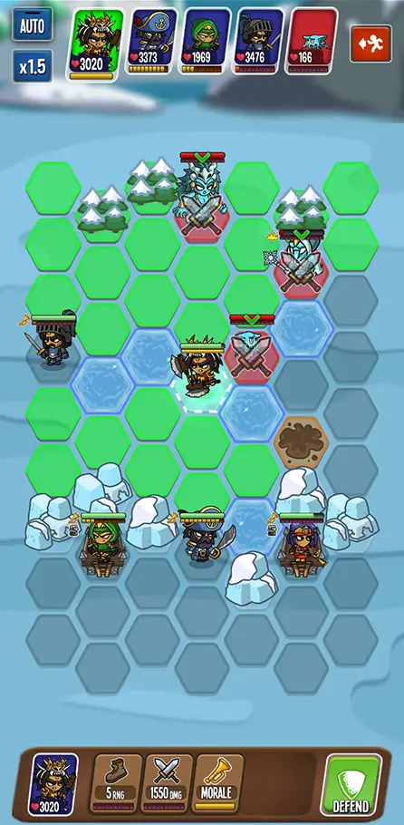
The main goal of this new HUD is to improve the UX infrastructure of the game, so it would be able to contain new features to come, and be easier to navigate.
Finding the Pains of the old HUD:
Asking the community – I’ve searched the community’s Discord channels for anything relating to HUD or navigation issues, and asked the community to share their thoughts.
User tests – I’ve examined old user tests for HUD and navigation issues. This gives important insight on our FTUE.
Our own personal experience – especially of the product teams, the devs assigned to it, and my personal testing and retesting.
Understanding the Needs of the new HUD:
Business – together with the CEO, CTO and VP product, I’ve planned when this new HUD should be launched to production and the scope of change we want to see.
Product– I mapped all of the current and planned features, looking for connections and hierarchy.
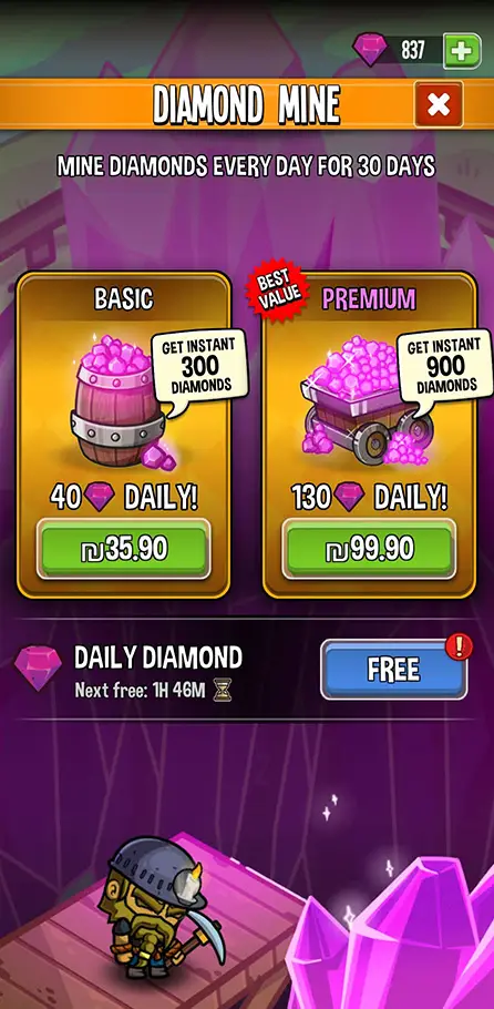
Balance & monetization – together with balance and monetization team, I’ve planned how to incorporate sales and rewards into the new UX architecture.
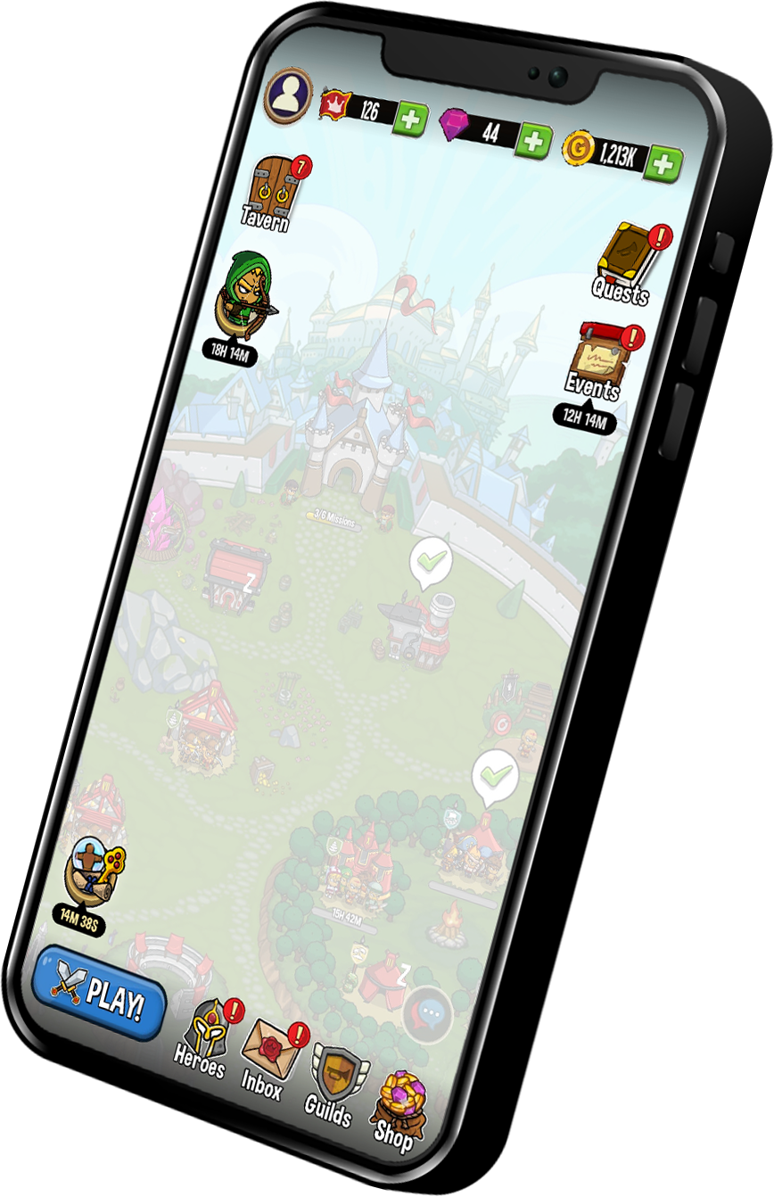
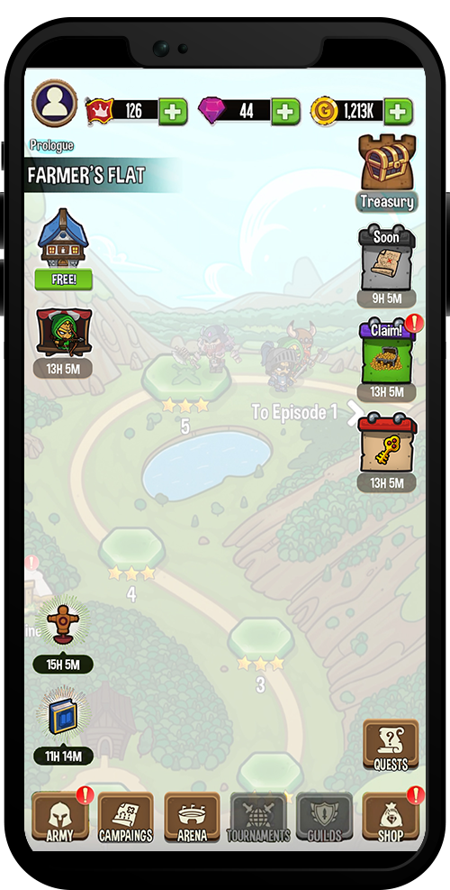
The old HUD
The old HUD
2
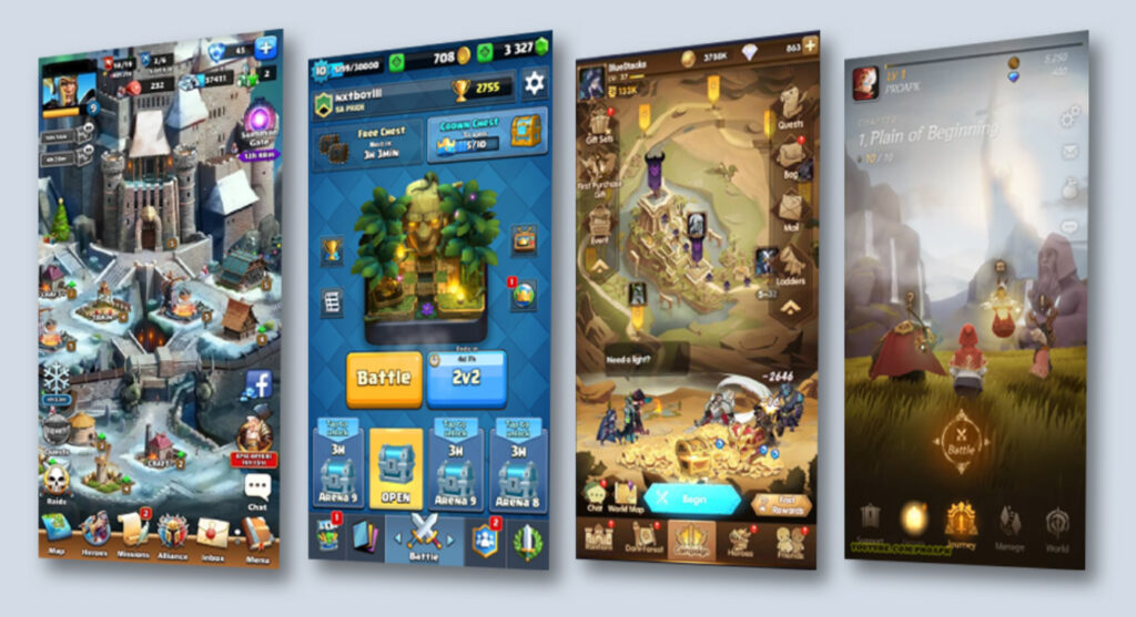
Competitors Research
I’ve researched relevant successful games, focusing mostly on those with portrait layout.
Understanding the HUD conventions that repeat in all games and contrasting them with each game’s original solutions, gave me important insights and directions for our own game.
3
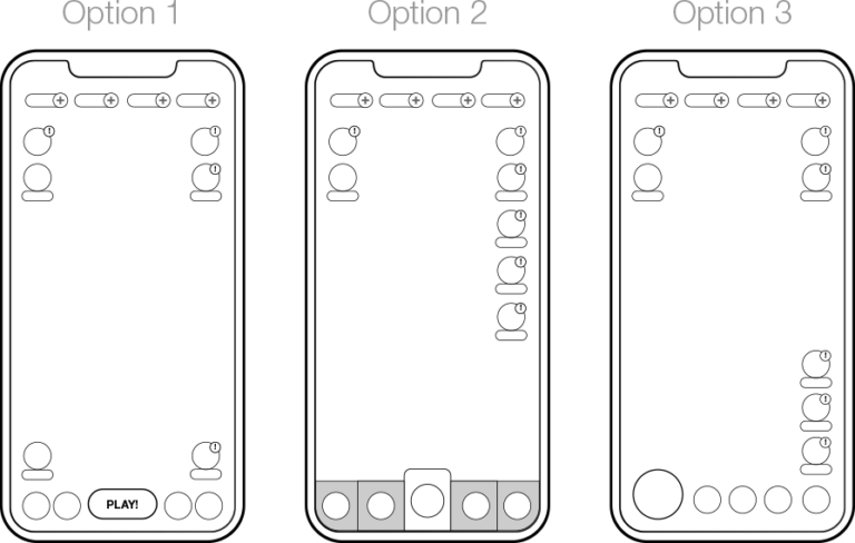
Finding the Right Approach
Main tool: Miro
After the research, I’ve designed several options using simple wireframes and flows. I’ve started with the HUD for the Home Screen, as it’s the most important one.
A few iterations with the CTO and VP product, and we’ve found our HUD option, with a clear UX plan and a place for everything:
4
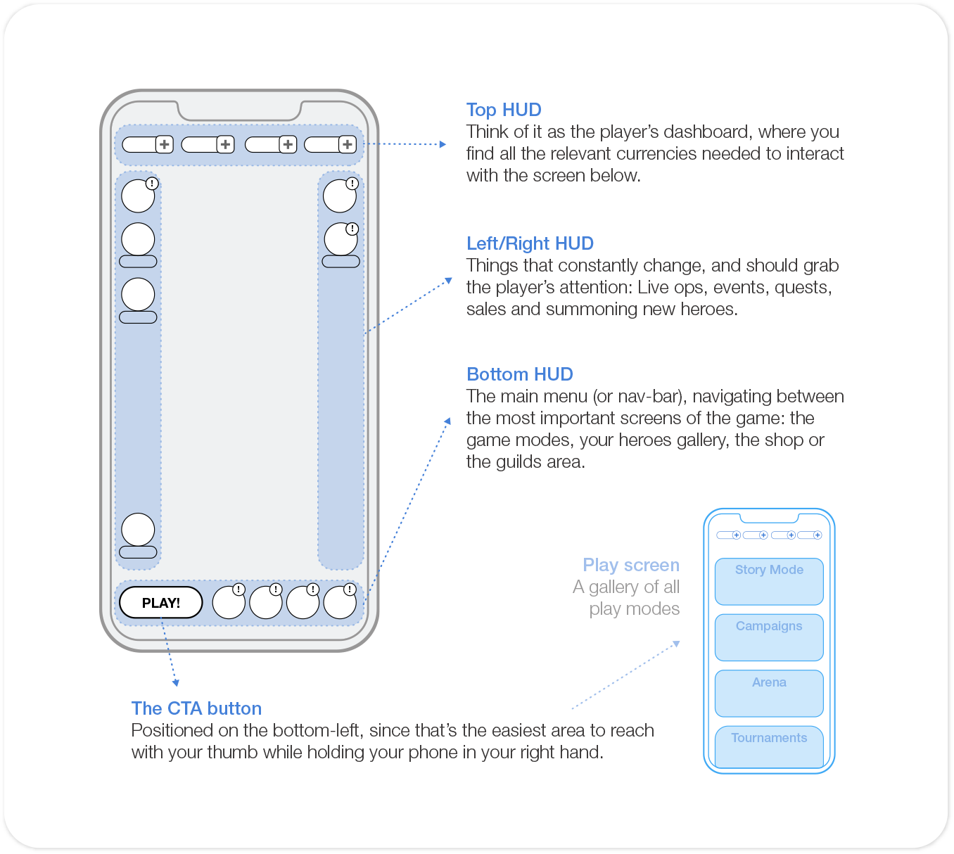
Specs & Wireframes
Main tools: Confluence, Figma / Illustrator / Miro
My favorite part!
Now that we found the right UX approach, it’s time to dig in and create detailed specs & wireframes:
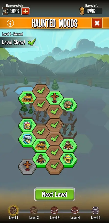
Which elements are placed in each HUD section, and in which order? How do they behave and where do they lead to?
How does the HUD change between screens? It should be as modular and simple as possible.
Which icons got a timers, and what do they relate to? Which got an ‘unread’ indication, and what turns it on/off?
In what order do we reveal and teach about the HUD buttons, and how?
How does the Play screen behave, and what info should it display?
I’ve answer all of these questions and solved all edge cases, using clear texts and wireframes. Love it!
5
Graphic Design
Main tool: Figma, Illustrator, Unity Editor
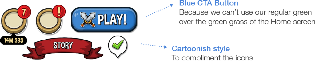
Icon design
The HUD relies heavily on graphic icons, so the art director and I planned a color scheme for the icons, and their overall style and complexity.
UI design
With my grahpic design team, we’ve designed all the UI elements (bars, timers, text, badges, indications etc).
6
Product Management
Main tool: Jira
When the specs where about 80% ready, my role as a product manager really kicked in.
First, the kickoff meeting, where I introduce and explain the feature to the CTO, VP product, art director, developers, QA, and graphic designers. I love kickoffs – the reactions, questions, thoughts, suggestions and technical restraints that I didn’t think of. This is where the spec becomes something real.
After the kickoff, the real work begins. I set up personal meetings with the devs and the Scrum master to plan and estimate the development and QA, making sure they’ll have everything they need by the time work begins. Bi-weekly standups with design and dev, making sure everything is on track and everyone knows what they needs to do and got what they need to do it.
Meanwhile, I’m changing and adapting the specs according to dev insights and needs, and keeping us on schedule while monitoring the Dev progress on Jira.
7
Monitoring the Results
After the new HUD is ready, it’s time to see if it’s doing its job:
Closed Alpha – playtesting in the office and with VIP players, followed by tweaks and changes.
Closed Beta – for our hardcore players, who offered much insight on the community Discord channels. Plus, remote user tests to gain insight on the usability and onboarding of the new HUD.
And finally, Production – checking that the important KPIs remain solid (they even got slightly higher!), and receiving feedback from the community.
