The official video game for the “Hunger Games” franchise, for web and mobile devices. Although it was published over a decade ago, it’s still one of my favorite projects.
Winner of the Webby award for Best Social Game (2013 – we were up against Clash of Clans that year!) Winner of Variety Entertainment award for Best Entertainment Based Mobile Game.
Directed the game’s brand and graphic design creation, and designed myself all the UI, icons and marketing materials.
Lead UX
Wrote specs, flows and wireframes, performed UX research, user testing and did some game design.
Content Team Lead
Lead a team of 2-3 interns the integrated the game’s new content. I designed tools and set the work flows of the content generation process.
Focus on
Directing the UI Design
This was the first time I’ve stepped up and lead and directed a product’s UI design process.
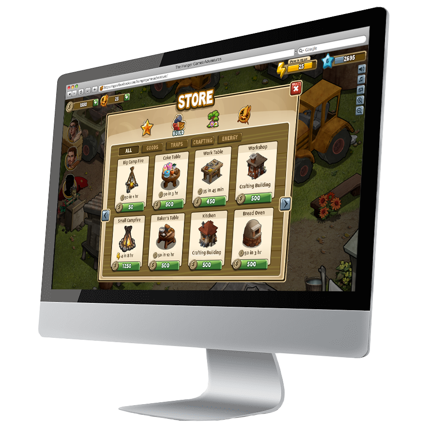
Our VP product worked with an outside studio to brand and design the UI building blocks of The Hunger Games Adventures. The studio’s draft wasn’t good enough, and I was called to fix it.
We wanted to combine the bright and cute UI design of the casual gaming market with dark and serious design of the Hunger Games brand. The two design approaches where very different, and mixing them was a big challenge.
Bright & Cute
Casual gaming UI
Dark & Serious
Official Hunger Games design
2
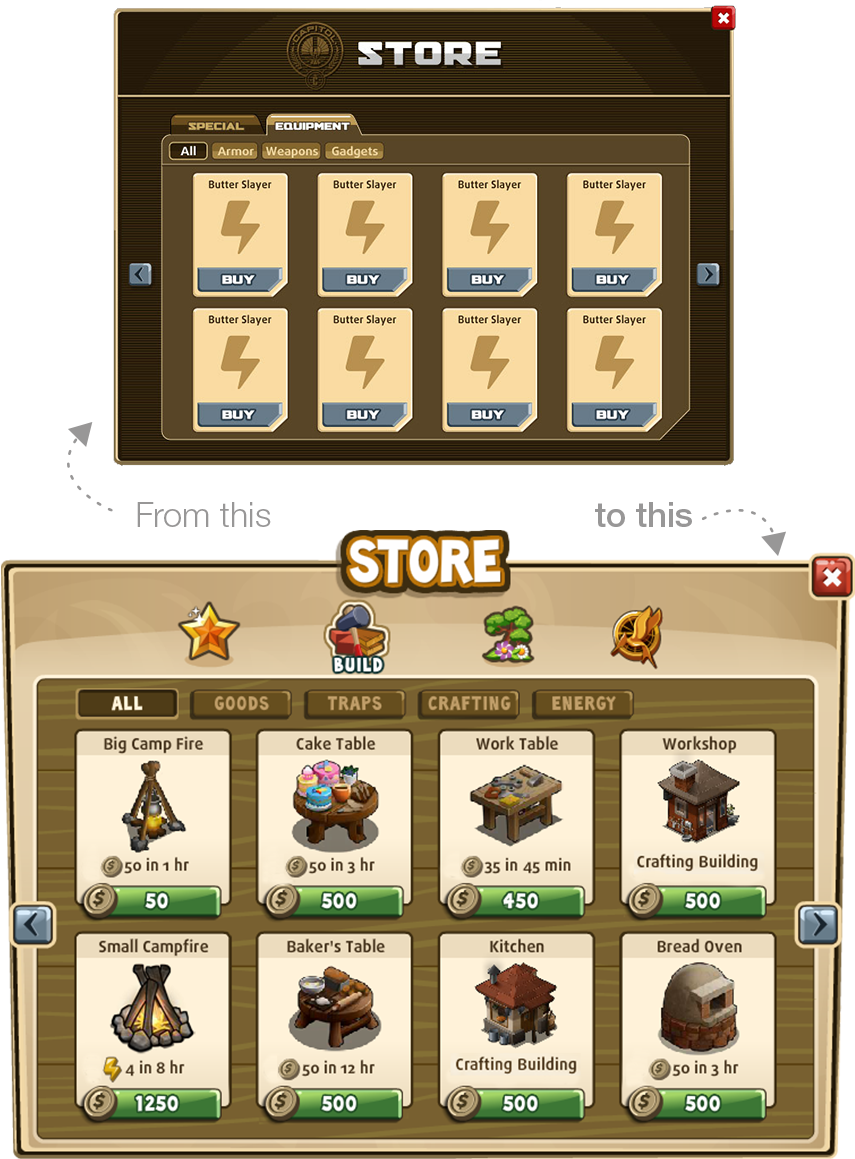
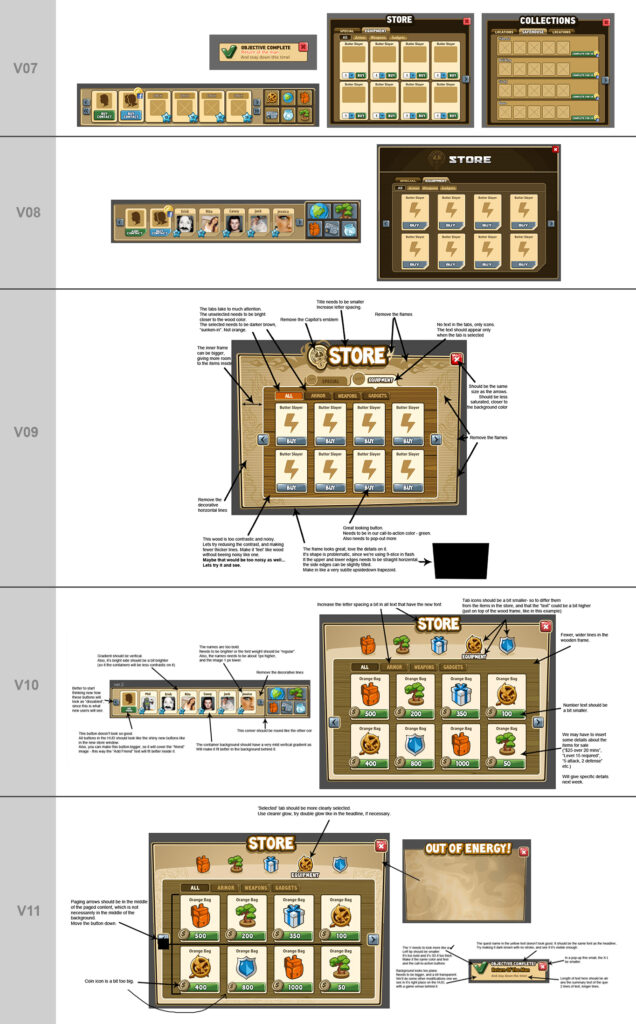
Initial UI Draft
The original draft we got was monochromatic, heavy and stiff.
After several iterations, our VP product couldn’t figure out where to take it, and how to make it work, and he asked me to give it a try, before changing direction.
3
I’ve Started Directing It
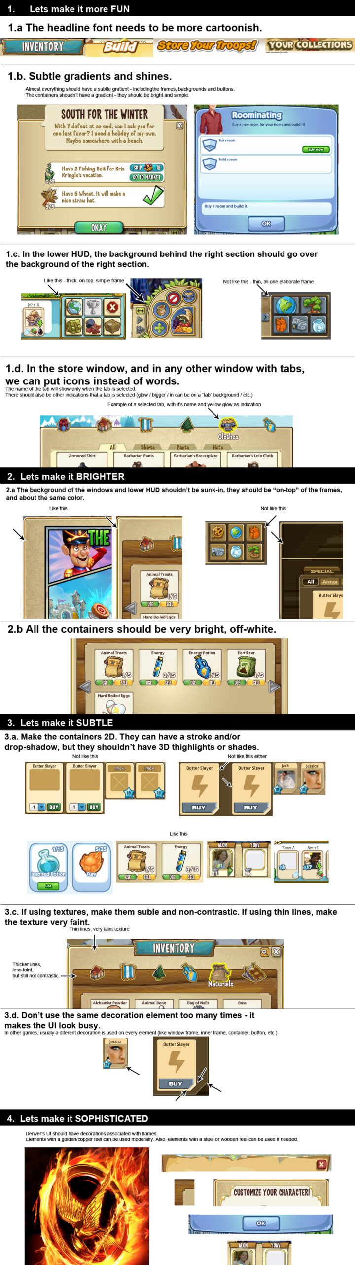
I started by researching the best social games at the time, and figured out that the drafts were lacking in 4 core values. The UI needed to be more (by order of importance):
Fun
Bright
Subtle
Sophisticated
I then wrote a VERY long and nitpicky document on how to implement them. Here’s a small part of it:
Really nitpicky.
4
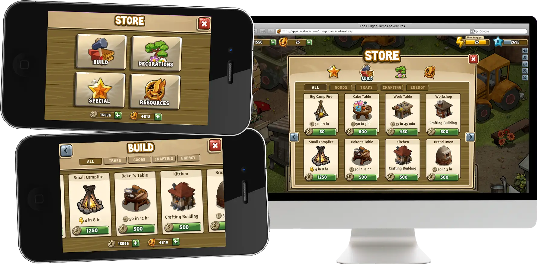
UI Iterations
Slowly but surely, we went back and forth – they sent new designs, and I’ve sent new directions. I’ve focused first on bringing the Store window to a level I’m satisfied with, and then continue to other elements.